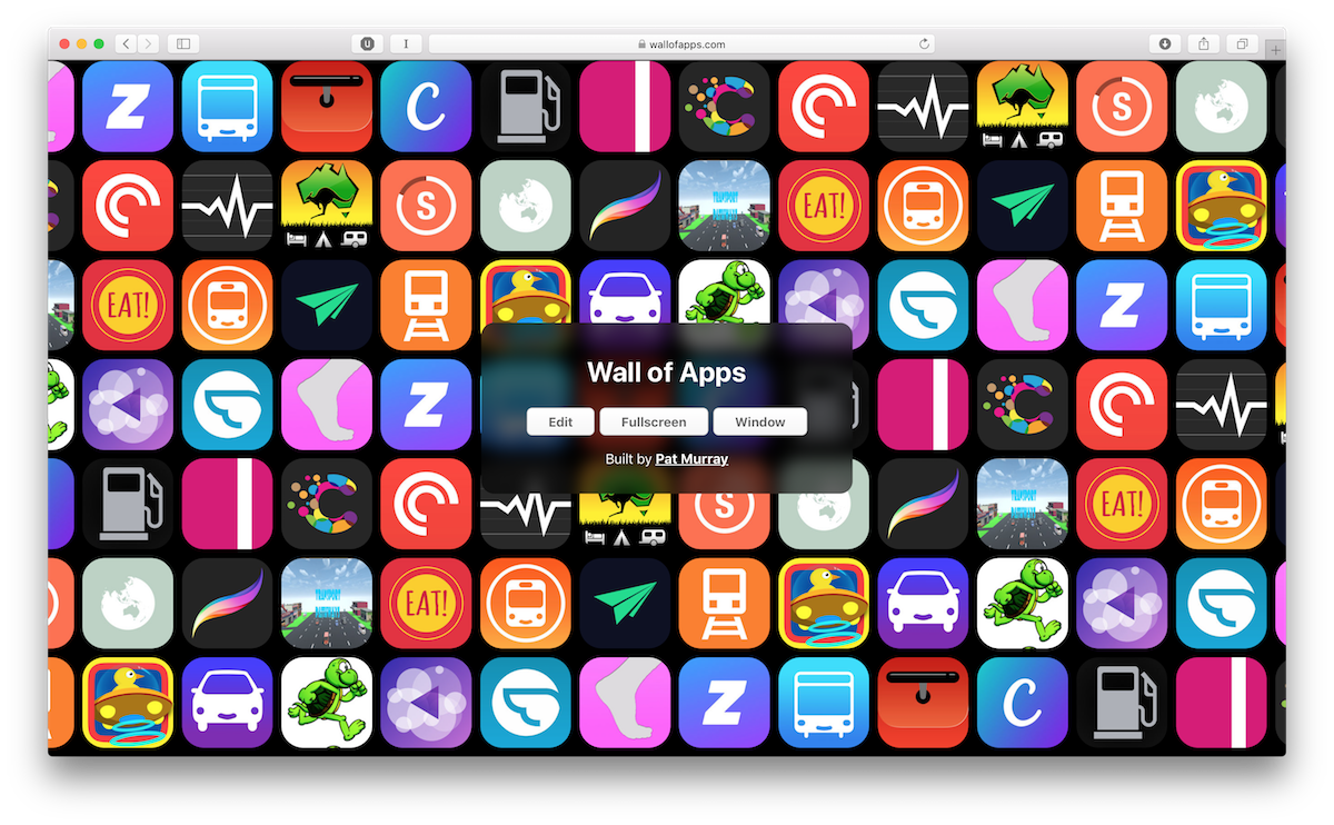
Wall of Apps
Building the WWDC 18 Wall of Apps in a Night
Episode Three of my podcast Making Things—yeah did you know I have a podcast about making things, called Making Things?—was recorded while I was making my latest side project. This post covers it in some more but possibly overlapping details.
At WWDC this year as we were waiting to be let into the keynote, through the door I could see this huge—absolutely monstrous—screen with a wall of apps on it. This was the preshow artwork, this massive screen slowly scrolling through famous apps, it was a game to spot the ones you recognised or even your own.
Ever since WWDC this year I wanted to build my own one that could be used at conferences or meetups. Last week I did just that, it is available at wallofapps.com.

It has a few features:
- It pulls in the current top free and paid apps from the US to start
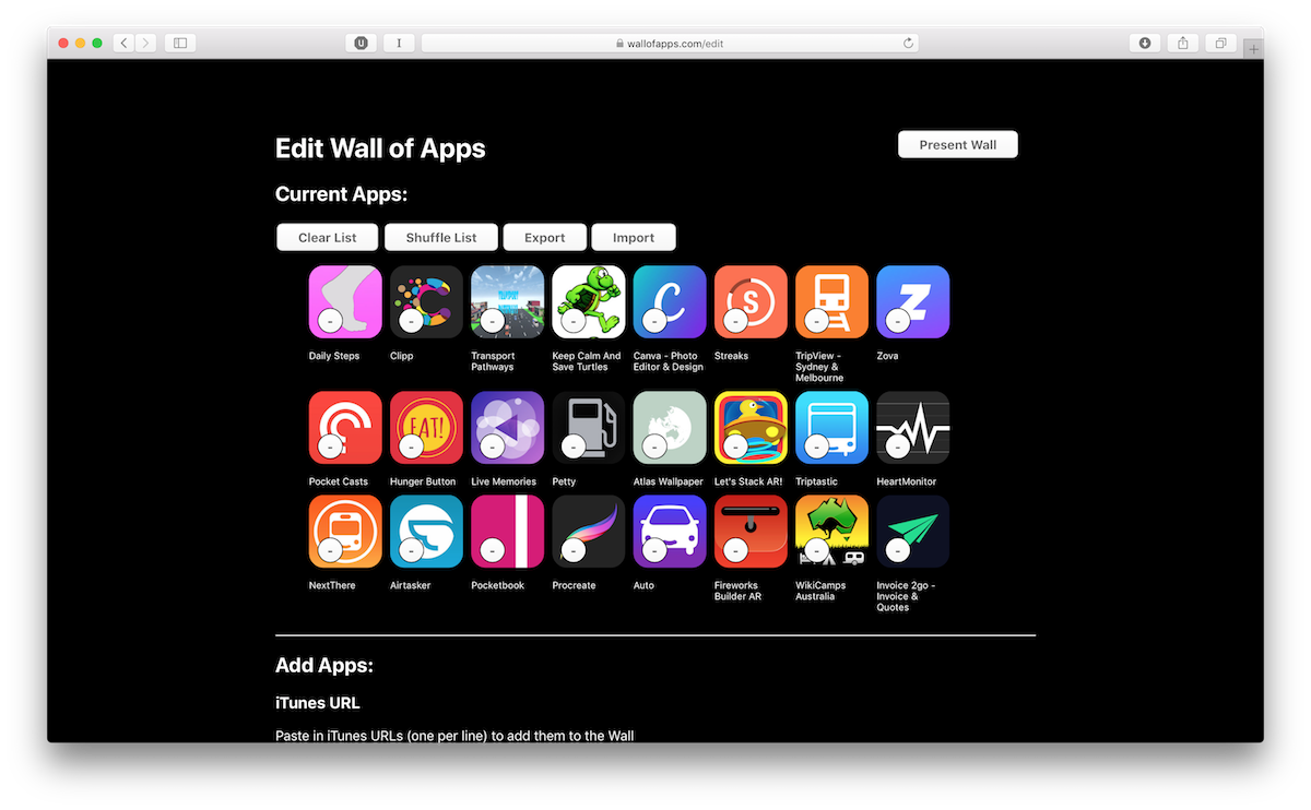
- You can customise the wall using just App Store URLs
- Walls can be exported, shared, and reimported easily using the edit interface
The webpage is a series of CSS grids inside another CSS grid. Each column—of seven apps as per the WWDC wall—is a single grid, and then all of those together make another grid. These are repeated out until the whole wall fills the screen (if there aren’t many apps in the wall, or it is very very wide).
To animate the wall, I some javascript that adjusts the left margin of the larger grid slowly. It also duplicates the grid when needed to ensure the wall never ends.
All the code is open on GitHub.
The website relies heavily on the LocalStorage APIs to keep the list of apps for the wall, and features fullscreen mode—along with detecting when fullscreen to hide UI elements—which are all APIs I’ve never used before.

Overall it was a fun project to build and came together quite quickly! Check it out: wallofapps.com (it looks great on a projector in fullscreen)
