
Bright-Coloured, Awesome-Tasting CandyMinimal Photography
Saying a photograph tastes awesome is an odd concept. A really odd concept. However, Matt Crump’s style of photography truly does taste awesome. Candy-Colored1 Minimal Photography (commonly referred to as CandyMinimal) is a style of photography focusing on the bright, the washed-out, the saturated, and the feeling of being amongst colourful-tasting candy.
Crump’s background is in advertising, working for the likes of AT&T, Lee Jeans, Walgreens and Samsung. He began the #candyminimal movement last year as an Instagram community for other buddying photographers to post their CandyMinimal photos.
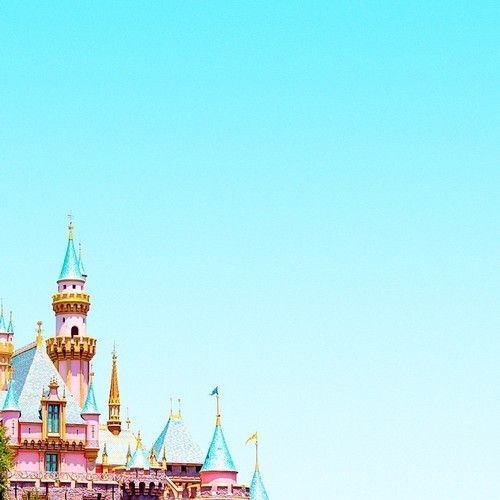
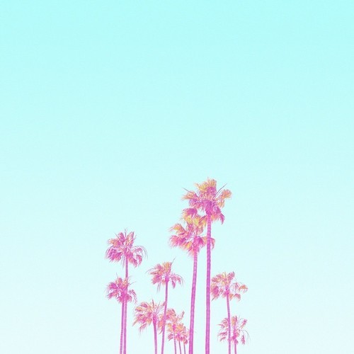

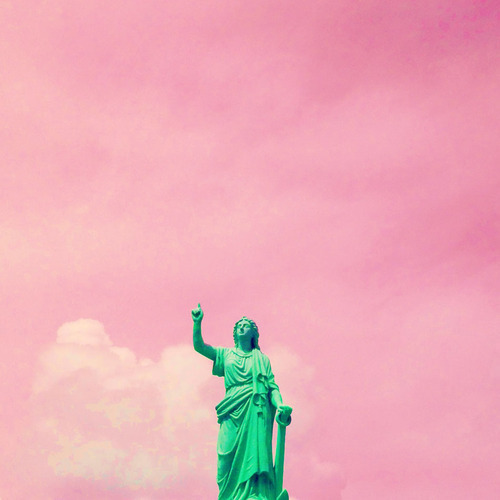
Above are just three select examples from Matt Crump’s Instagram profile. From the first time you see CandyMinimal photographs, to the point where you’ve seen thousands in an attempt to write a blog post about them2, the amazing effect never seems to wear off. They’re not novel, yet they’re so incredibly novel.
In a how-to guide posted to his site, Crump shows just how simple it is to create these unique and amazing photos. He manages to produce these photos using only the stock iPhone camera app, the Diptic app (for cropping and hue), and the PicTapGo app for a final filter.
The basic premise of the photos is to use a solid background with just one object in the foreground (crop-out all other objects or buildings). All photos are then hue shifted to create a colour-pallet that falls somewhere between ultra-real and surreal. Then the photographer applies a collection of filters of their choice to achieve the desired effect.
The CandyMinimal artistic style is a modern-day intentional version of the results of cross-developed film. Cross-developed film photography is the use of incorrect developer with a certain film, the results are usually miss-matched colours and odd hues. CandyMinimal resembles this for me, however, not all CandyMinimal photos are of this nature. Some images, such as that embedded below, show the other side of CandyMinimal photography – the ‘minimal’.
This photograph taken by Andrew Bartholomew (@surfistatomato) shows how CandyMinimal photographs can seep into our everyday photography without becoming as overpowering as some of Matt Crump’s.
So I encourage you to try out CandyMinimal photography, and take some of the principles learnt – solid background with a minimal foreground object, colours shifted, and an eye for the ultra-realistic – and apply them to your everyday-photog.
Happy Shooting!
-
“Candy-Coloured” if you ask me. But the guy who coined the term is American, so his spelling is what I’ll use. ↩︎
-
Okay, maybe not thousands but certainly plenty. And from a whole range of photographers. This style has far-far surpassed that of one man. (There are reported to be more than 15,000 Instagram photos in the #candyminimal tag) ↩︎